Safari Responsive Design Mode
- Date:
- 21 February 2019
While most browsers have responsive emulation available from their web inspector, Safari has a completely separate system available from the debug menu.
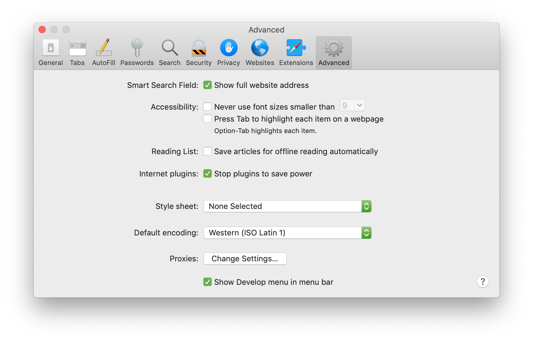
If you don't have the debug menu enabled, check the "Show Develop menu in menu bar" checkbox at the bottom of the Advanced tab in Safari's preferences:
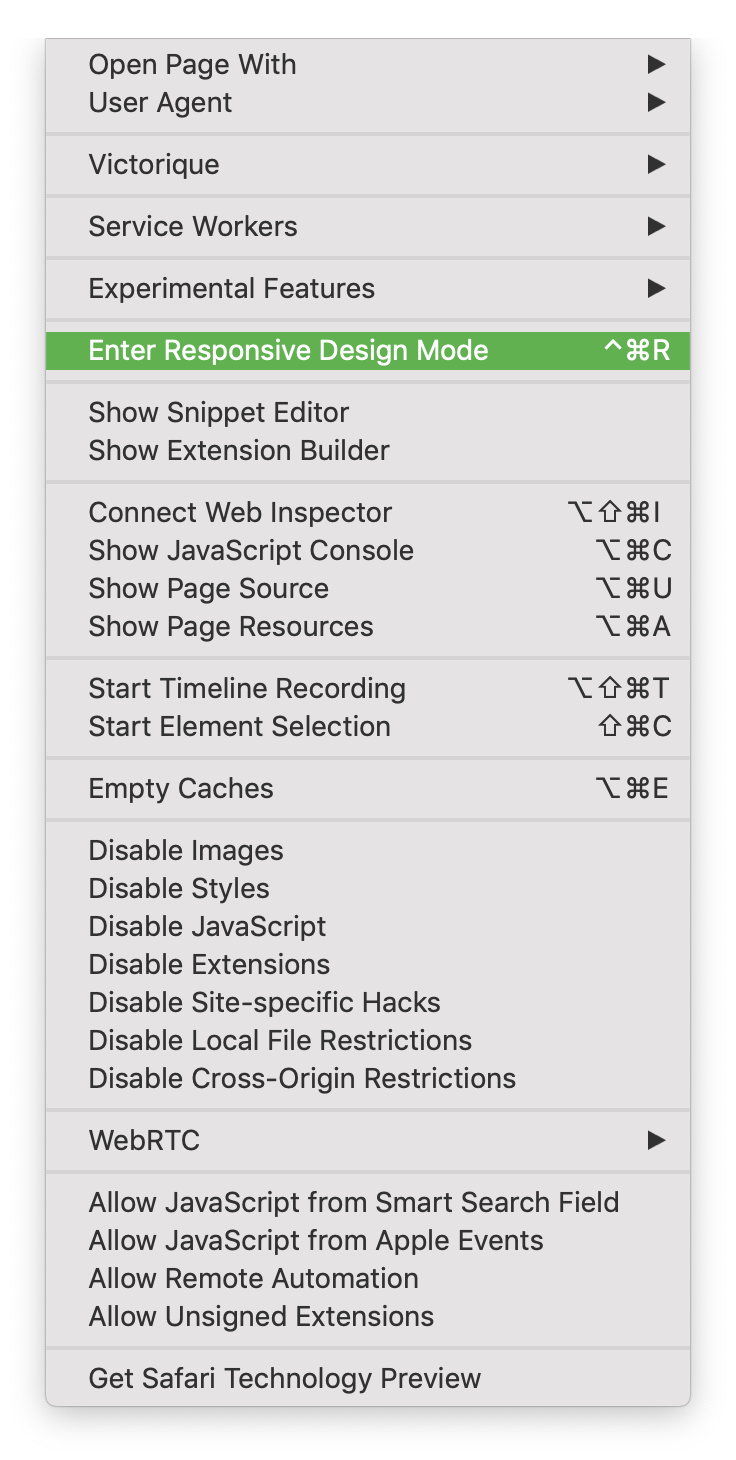
Responsive Design Mode can be enabled by using the ^⌘R (control + command + R) shortcut, or by selecting it from the Develop menu:
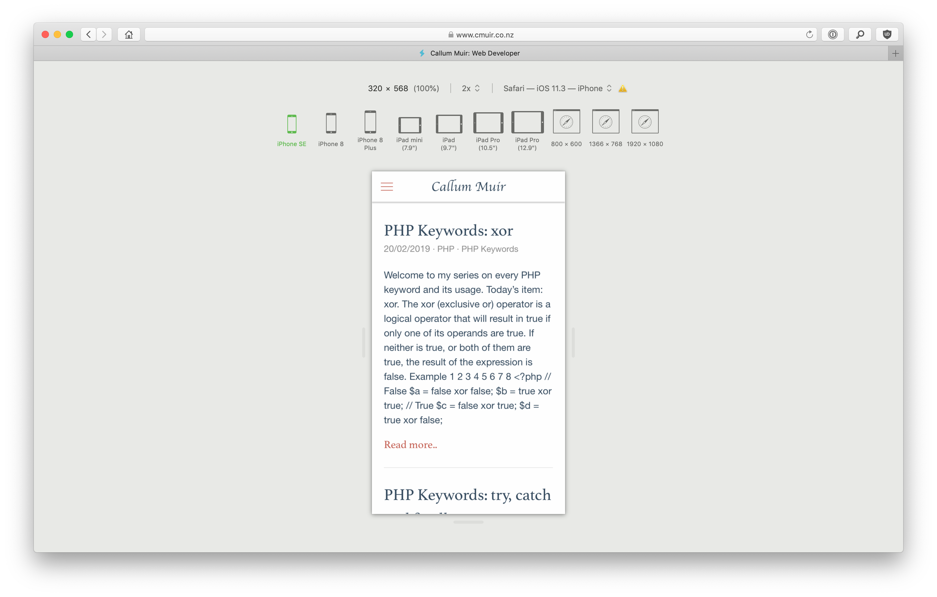
Once enabled, Responsive Design Mode will display a list of possible screen sizes, and the current webpage at that screen size:
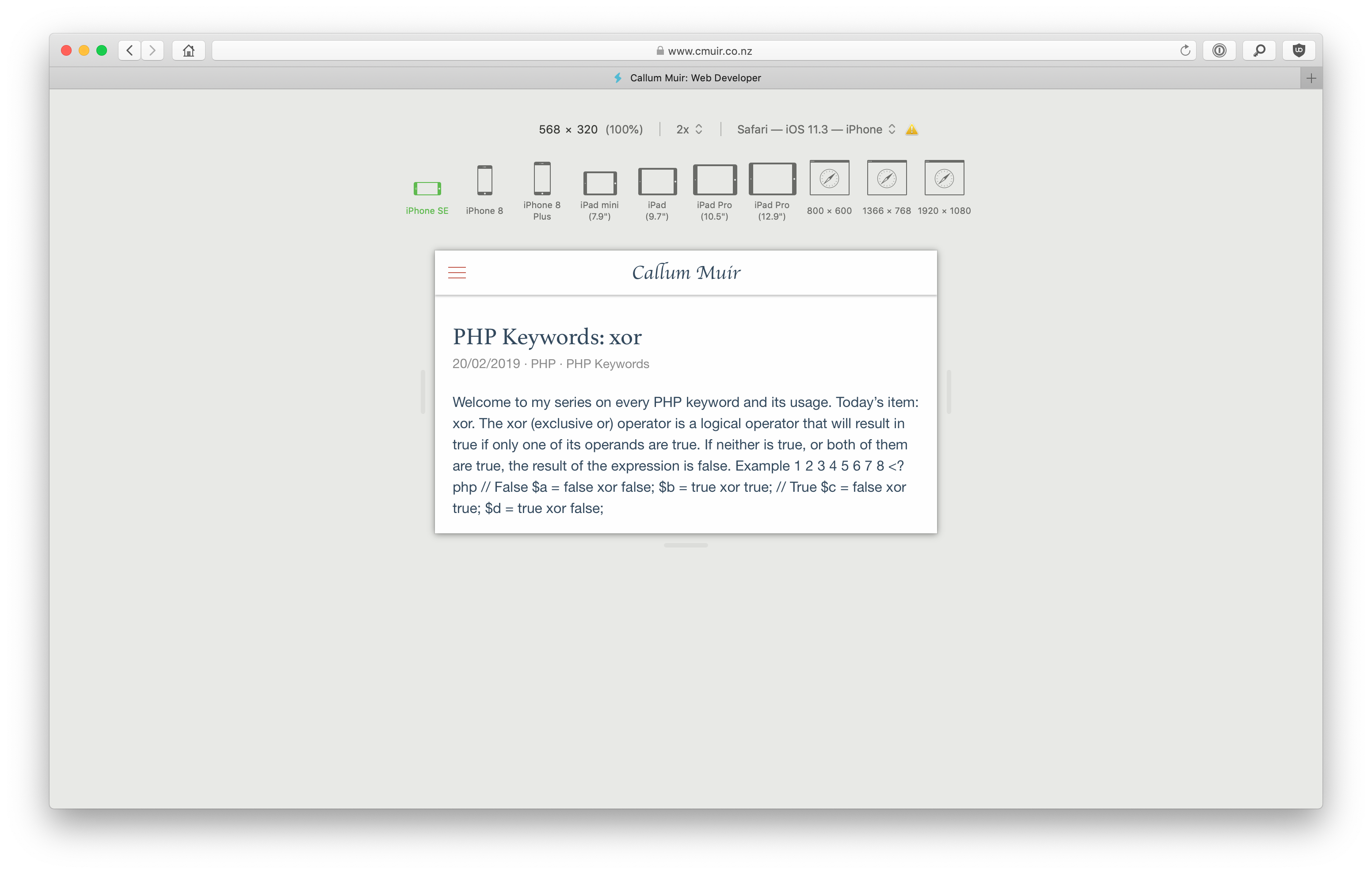
Clicking the current screen size again will display your site in different configurations. For example, the iPhone SE device will rotate to landscape mode:
You can drag the right and bottom edges of the viewport, in order to make the viewport larger or smaller.
Note that if you do this on one of the web viewports, that size viewport will replace the viewport that you have selected. iPhone and iPad viewports, however, will always retain their native dimensions.